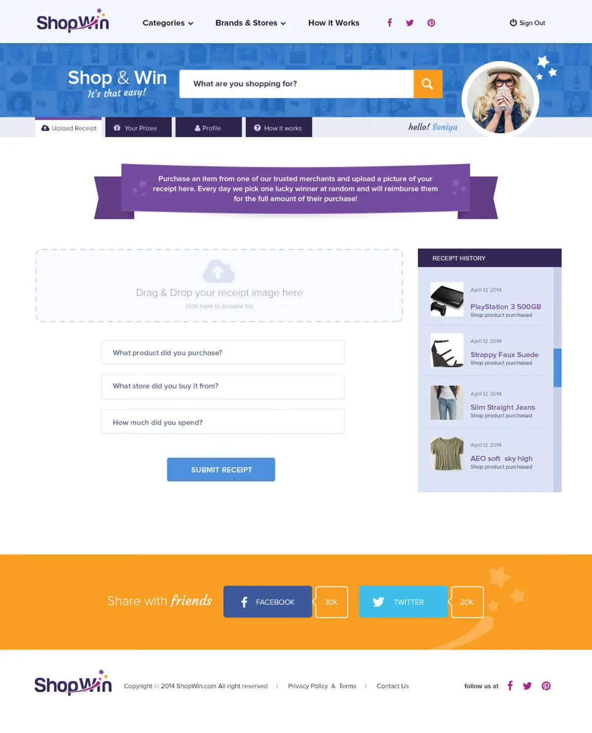
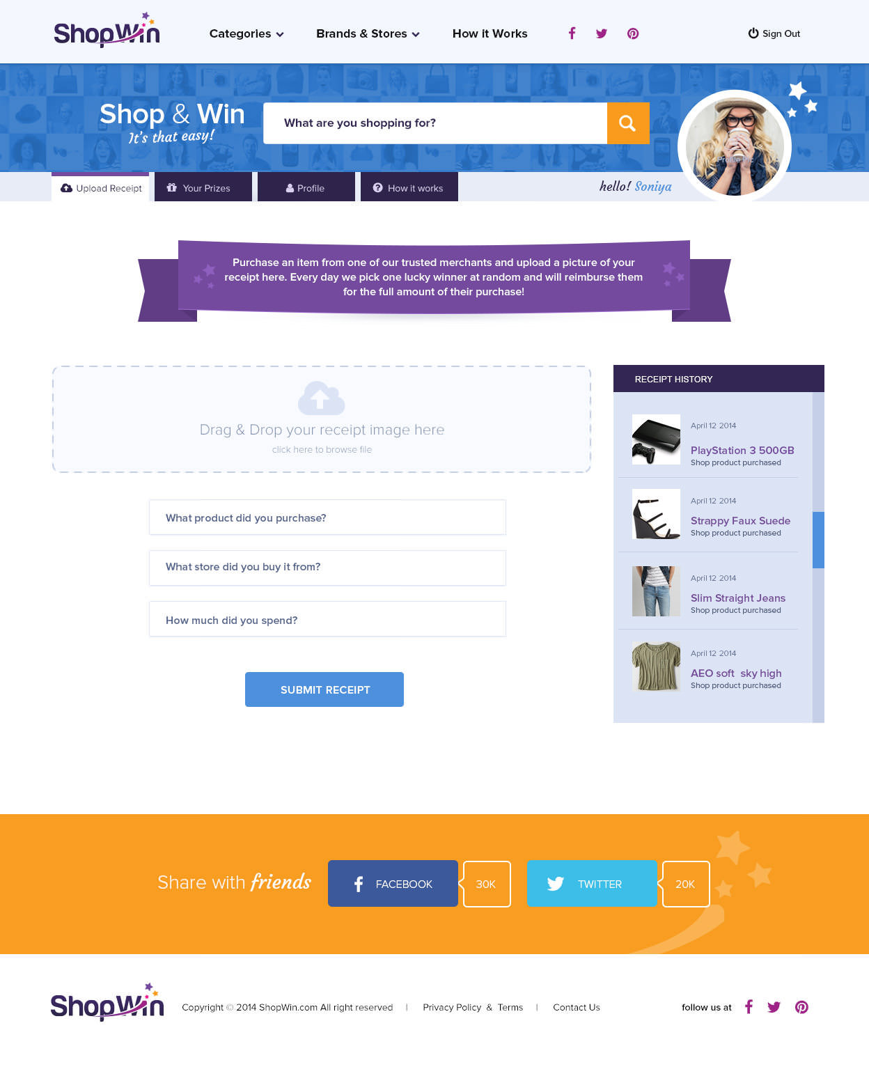
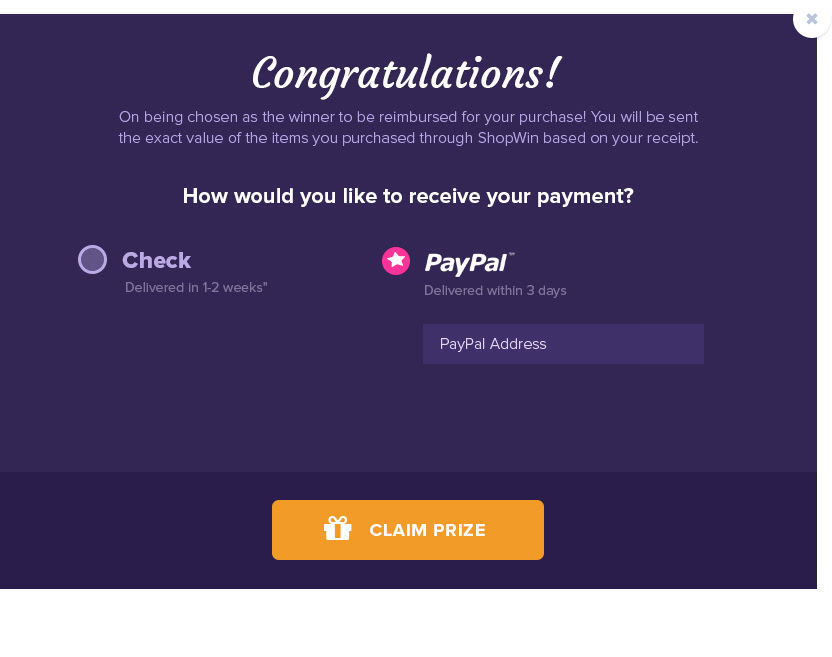
Shop n win is an advanced e-commerce website of store type. It is combines everyone’s two favorite things, Shopping & Free prizes. It has extremely features, easy to use and fully responsive, it looks stunning on all types of screens and devices. It comes with a lot of useful and features and unlimited variations. Our challenge to build search engine to bring the best product from name retailers and add instant win prizes and chance to be reimbursed for you purchase.
Shop & Win Web Design: THE CHALLENGE

Interface Design of Shop & Win
Wireframing before visual design allowed us to map out the entire site, making sure we met every business goal and covered every benefit. Interactive design with such an expansive product, it was superior to wireframe every view and interaction before starting visual design. This product would be used by retailers with an audience that instant win prizes and chance to be reimbursed for you purchase. Wireframing before design ensured a complete and thought-out user experience.


Colors
Unique and comforting color palette create stylish, vibrant, colorful website filled with engegy.

Studio
R: 116 G: 74 B: 158
hex code: #744A9E

Carrot Orange
R: 248 G: 155 B: 29
hex code: #F89B1D

Dark Purple
R: 159 G: 36 B: 135
hex code: #9F2487

Deep Pink
R: 237 G: 28 B: 145
hex code: #ED1C91

Christalle
R: 56 G: 40 B: 94
hex code: #38285E
Typography
Proxima Nova works well for screens. It has great readability, flexibility and trendy.
Proxima Nova Font
Light
Regular
Bold
Extrabold
Aa Bb Cc Ee 0123.!?#
Aa Bb Cc Ee 0123.!?#
ABCDEFGHIJKLMNOPQRSTUVWXYZ
abcdefghijklmnopqrstuvwxyz
0123456789 @#$% (.!?,:;)
UX/UI Design
E-commerce sites can be sincere, but with Shop n win, it required a bit more reflection
to convey the benefits of everything they provided to run a business: payment processing, searching, and business operations solutions. Depending on a user’s progress through the site, they might not experience Shop n win’s two main offerings. We designed a lot of this content as repeatable modules, which allowed us to utilize it throughout the site to cushion this message. It also allowed us to create consistency across the site, delivering a integrated web experience and speeding up the design and development process.


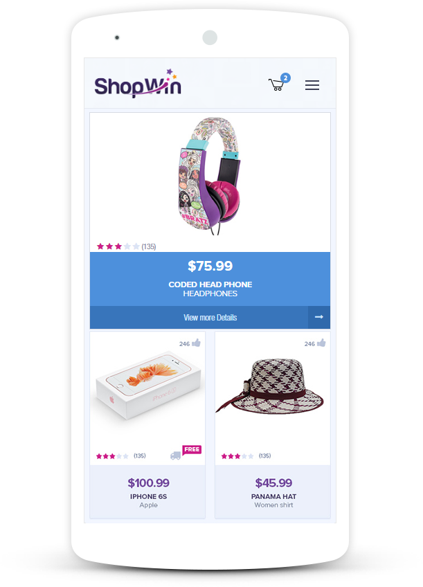
Mobile Responsive


