Design Challenge
It was our job to take who Gosite is and how it presents visually and weave brand communications into the experience. Gosite is fun, creative, and witty. Their brand was maturing, adding dimension to a company already known for ease of use in the software to power your business online. But the real challenge came in designing and developing a flowing website that could communicate how real needs and rewarding their platform is to use.

Branding
We kicked off Gosite brand strategy with a team exercise on the client side and a concepting round on our side to nail down brand essence. A prescription for a whole that exudes believability, sales confidence, and grit. We sharpened the letterforms, slimmed the iconography, and—after tweaking the primary brand color—limited the formerly abundant color floods.


Our Approach For GOSITE
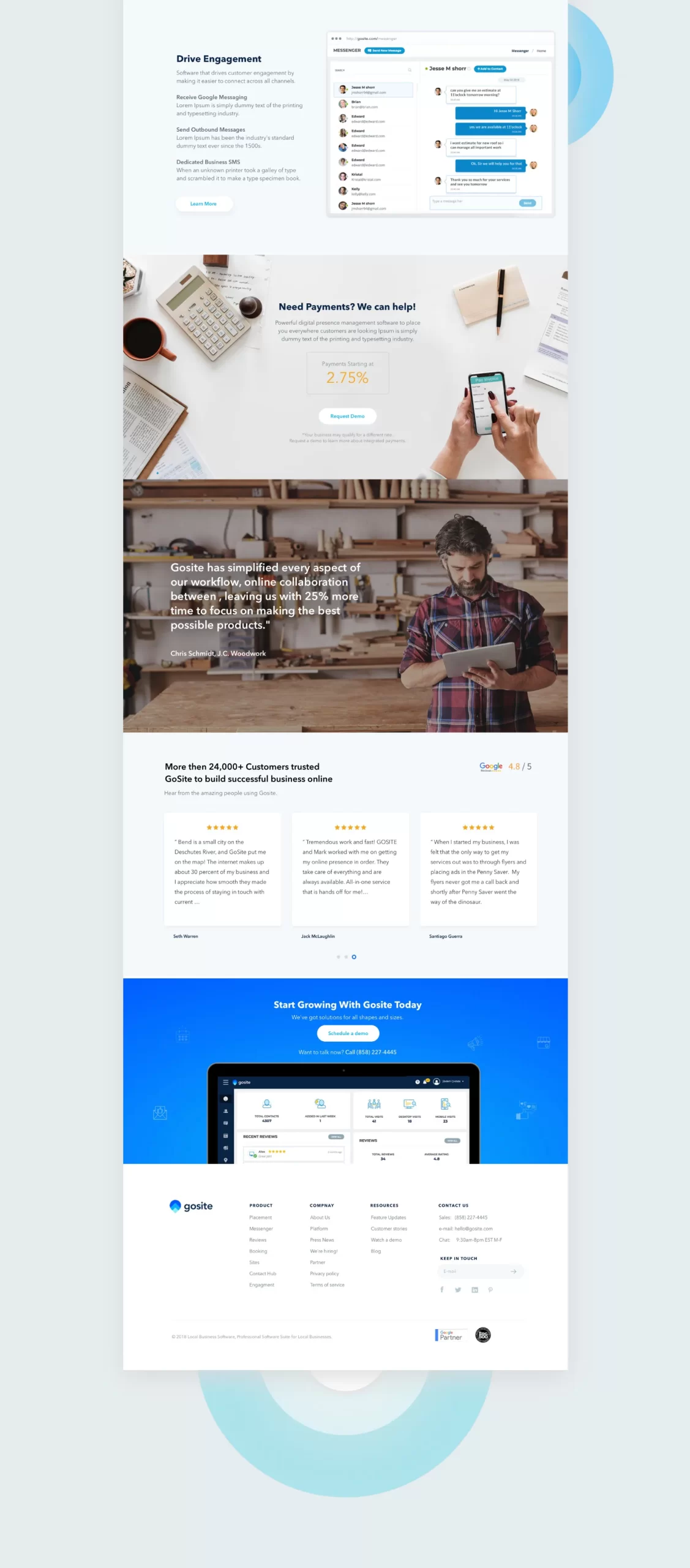
Nearly every member of the team lent their magic to this project, which required a long, expertly managed project timeline. Not only did we build a whole new brand system to create content around, we got mega-strategic with information architecture to streamline content that had grown quickly with their success. The new website honors their commitment to the client experience, with easy-to-navigate actions, appetizing verbiage that communicates a lot without overwhelming.

The Solution
Our challenge was to make an identity which speaks sophistication but still making it premium looking. We started by working with ampersand because Sasha is a big fan of ampersand so we decided to incorporate the S into the ampersand to give more premium feel to the brand identity.
The brand color palette consists of 2 colors which are pink pastel color as emphasis on any skin tone, with main color accent – black, which perfectly associates with luxury theme.
The goal was to design a sophisticated brand identity including the naming, identity & packaging with a clean aesthetic, elegant typography and an overall premium feel.


ALEX GOODE – CEO, GOSITE SAN DIEGO, CALIFORNIA


