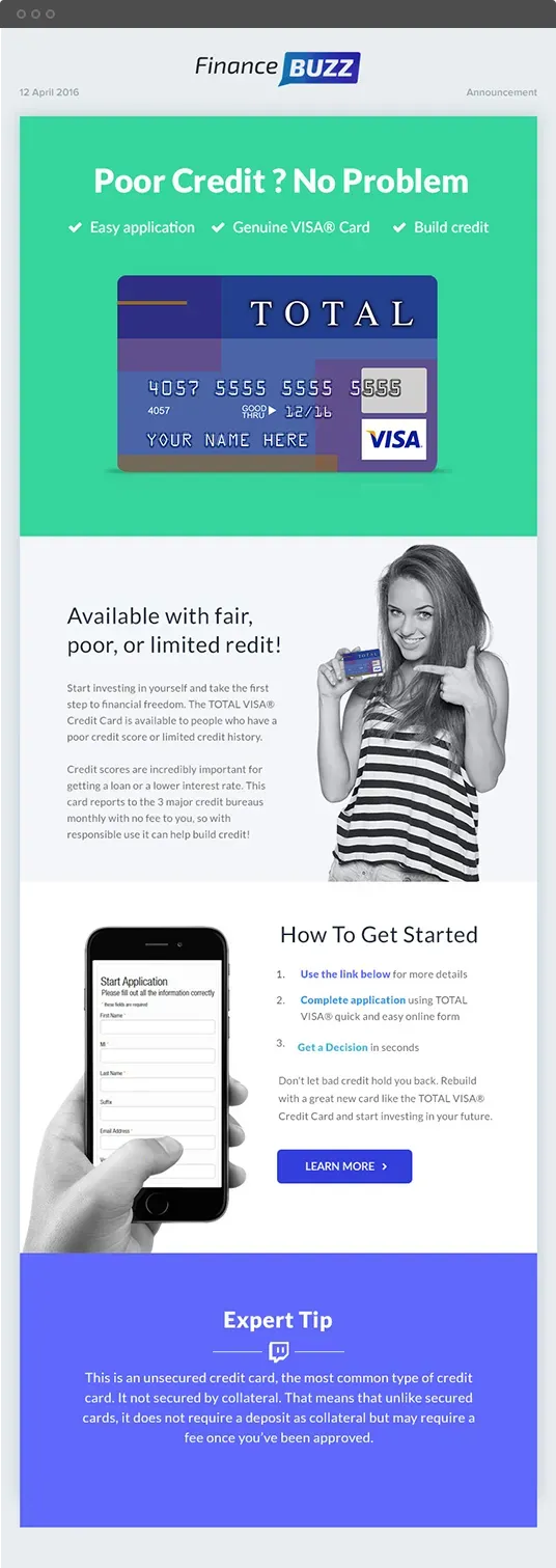
The value of providing the exact information your clients, customers, and prospects are looking for — without all of the fluff that can make emails lengthy, intimidating, and difficult to read. The design is simple, appealing, and easy to scan, with a call to action set apart on the side and emphasized by both a different color and a border.

Clean & Simple Email template
It took us 2 months and a lot of long evenings to create this. But I’m proud to say that we completed the screens. It’s one of the biggest projects which we’ve ever created.


Color Guide
And here is which color we used.

#2521a3

#36d59d

#2521a3

#3594e6

#3cb4d9
Typography
Lato works well for screens. It has great readability, flexibility and trendy.
Lato font family
Light
Regular
Bold
Extrabold
Aa Bb Cc Ee 0123.!?#
Aa Bb Cc Ee 0123.!?#
ABCDEFGHIJKLMNOPQRSTUVWXYZ
abcdefghijklmnopqrstuvwxyz
0123456789 @#$% (.!?,:;)


