

Website
Services Provided
- Brand Design & Strategy
- Branding Solution & Stationery
- Web Design & Development
- SaaS Product Design
- Digital Marketing Solutions
- Presentation
About Levanta
Levanta is an affiliate platform for Amazon and Walmart sellers. Sellers use it to recruit, manage and pay affiliates and creators. Creators use the same platform to earn commission across marketplaces. This case study shows the brand system that supports both audiences, in the order it is applied, from the logo through to the product and the people.
The Challenge
Levanta needed one visual system that could speak to sellers and creators at the same time. Sellers want a clear, credible platform for managing affiliates.
Creators want an easy way to earn. The site, the e-book, the merchandise and the dashboards all had to feel like one company, so the brand rules were written to cover every surface.
Levanta serves two audiences with one platform. Sellers need to recruit and pay affiliates. Creators need a place to earn commission across marketplaces. The brand has to feel authoritative enough for sellers and warm enough for creators, and it has to work across web, product UI, email, print and merchandise.
At a glance
$1M+
REVO sales
2,200
REVO active creators
550%
Front Row programme revenue growth
274%
Lockstar sales lift
Re-Branding
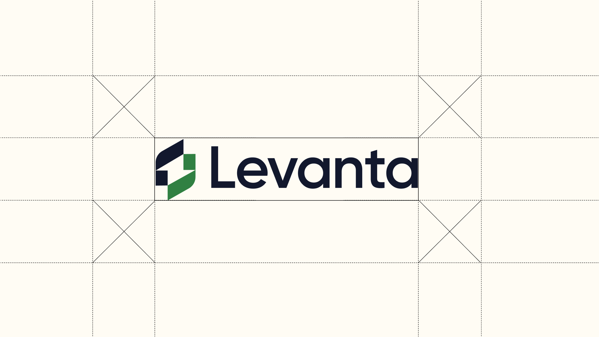
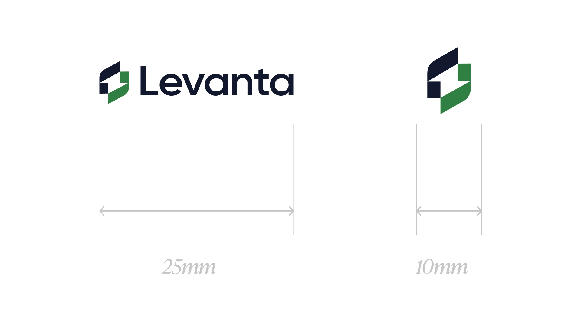
The logo is the first thing a seller or creator sees, so its rules are strict. Clear space keeps the mark from crowding text or edges. The minimum sizes stop it becoming unreadable in print or on a small screen. Approved colour pairings keep it legible on the deep green, honey gold and ivory backgrounds the brand uses.
The logo is a green mark beside the Levanta wordmark. The mark and the wordmark are always used together in the main lockup. Use the logo on the approved backgrounds only, so it keeps its contrast and its shape wherever it appears.
- Do not stretch, recolour, outline or add effects to the logo.
- Do not place text or graphics inside the clear space.




Colour
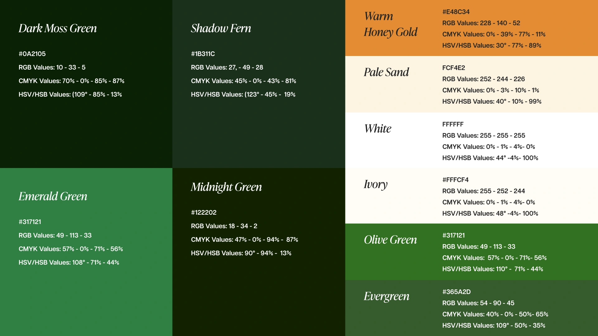
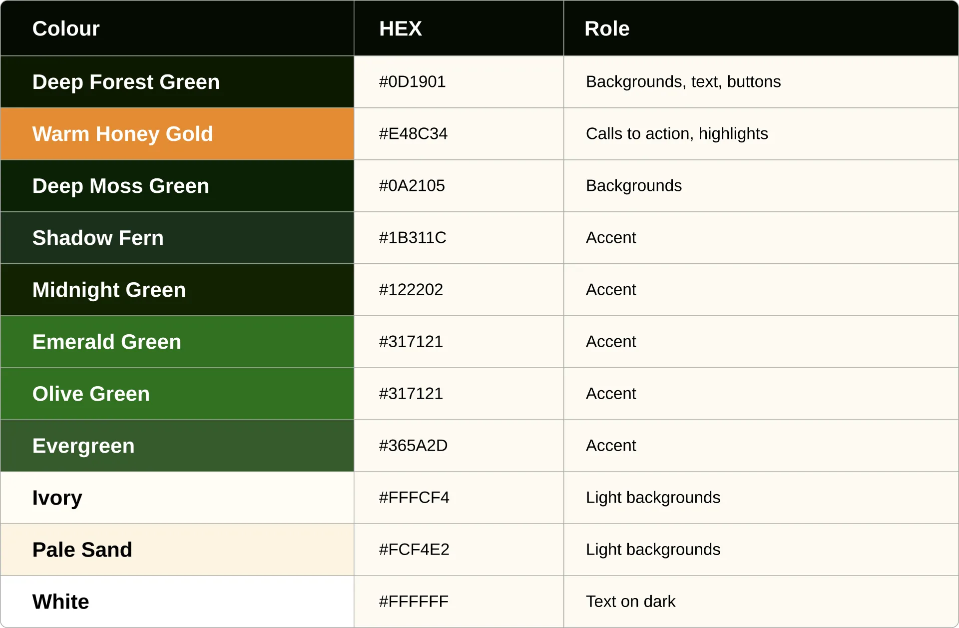
Deep Forest Green does most of the work, as the background for the website, dashboards and print. Warm Honey Gold is kept for calls to action and highlights, so the eye goes to the next step. The ivory and pale sand tones give the light surfaces warmth. Accent greens are for depth and should not replace the core palette.
The core palette sets the look: deep greens for backgrounds and text, and warm honey gold for calls to action. Accent colours add depth and are used sparingly, so the core palette always stays dominant.
Gradients
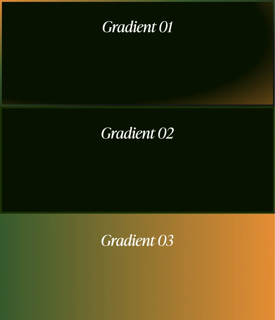
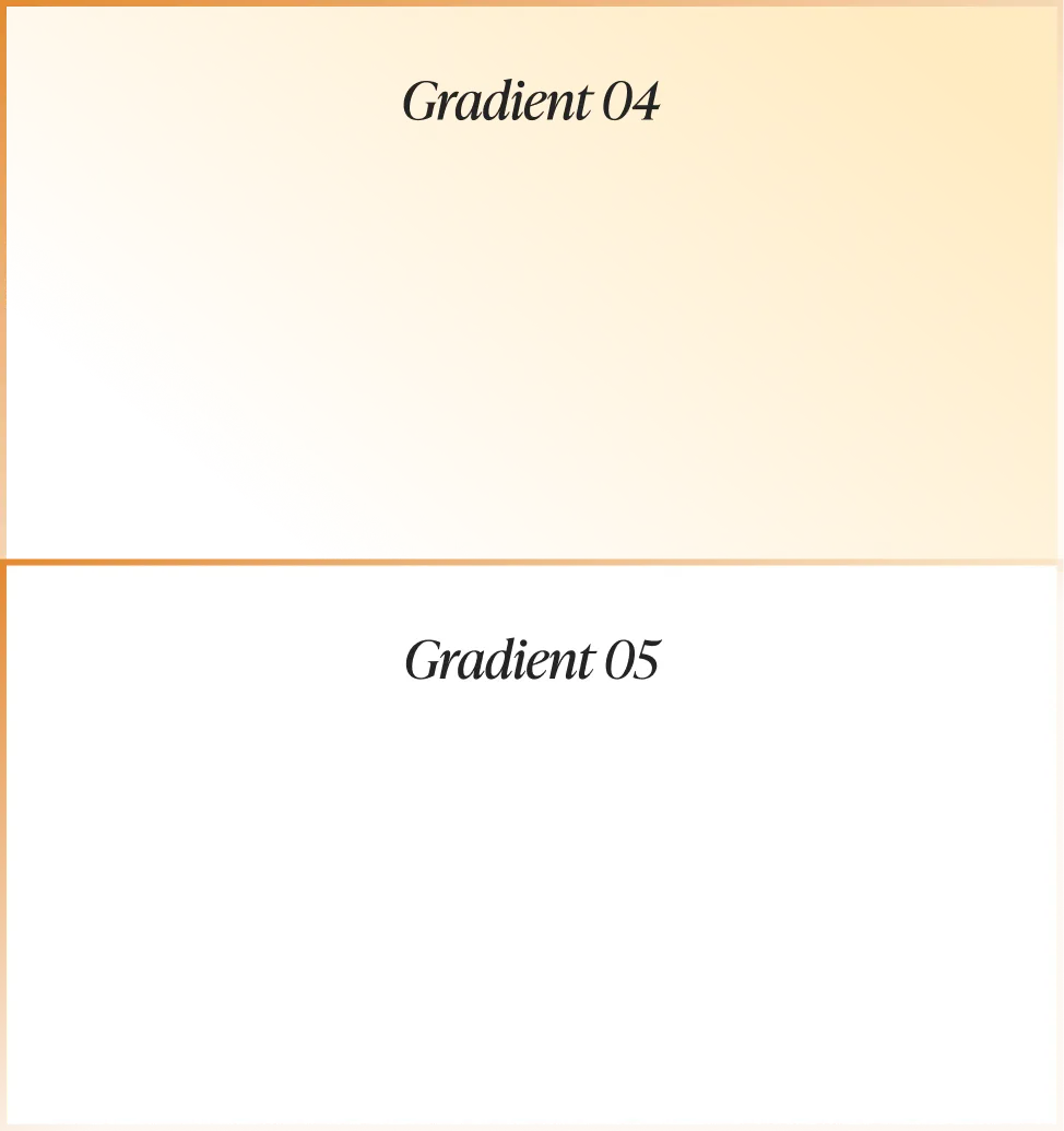
Gradients add depth to large surfaces such as presentations and social graphics. They run vertically only, and each uses approved colour stops. Product screens, the website and email stay flat, which keeps text readable and load times low.
Gradients are vertical only and use approved colour stops. They suit presentations, social and print. Product UI, web and email use flat colour.
Pattern and texture
The pattern is built from the same geometry as the logo and is used as a quiet texture behind seller-facing and corporate material. It is never used in creator marketing, so creator content keeps a clean, personal look.
Patterns are restrained and used for seller-focused or corporate assets only. They are never used in creator marketing.


The brand in environments
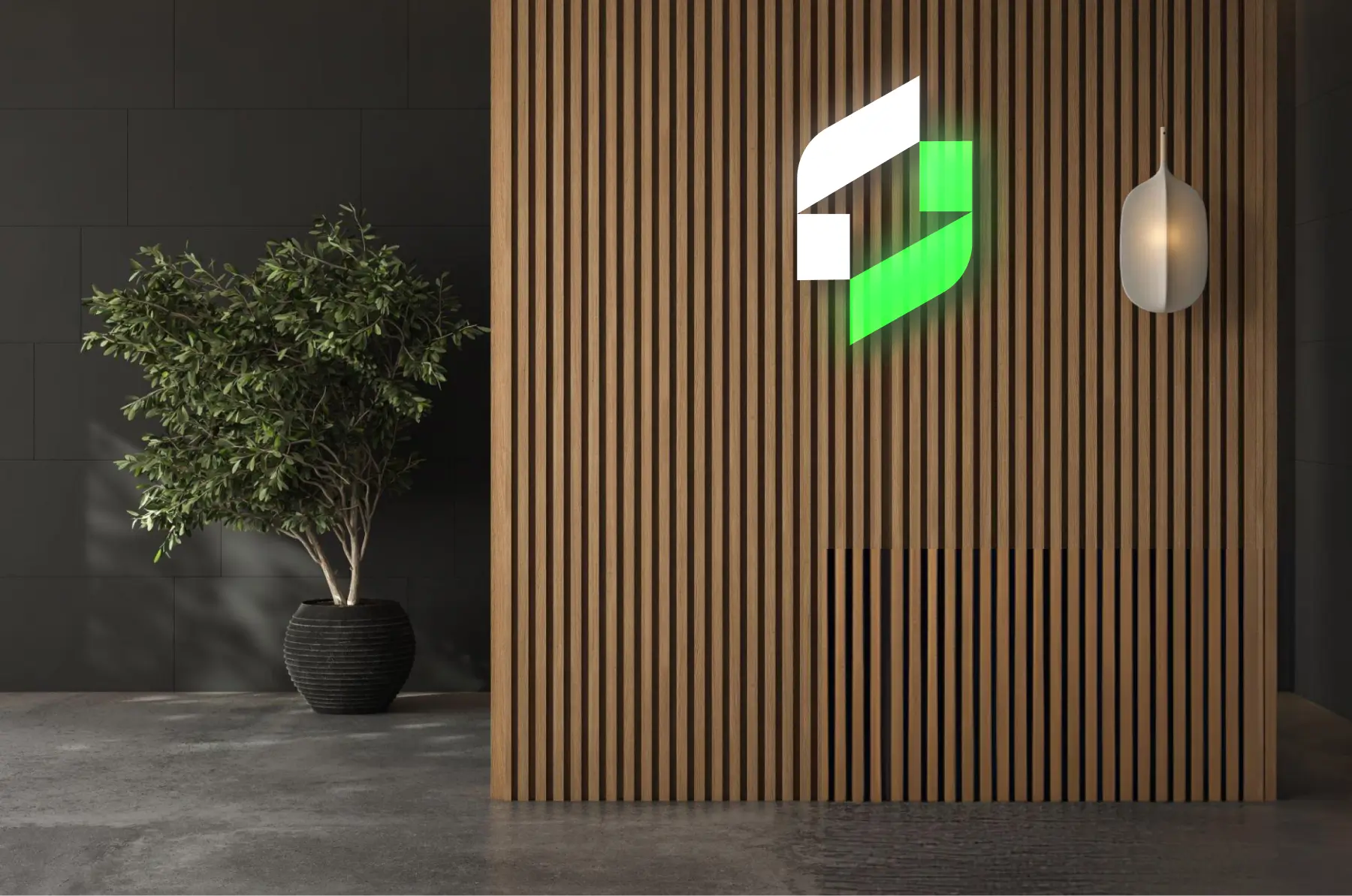
The mark also appears on physical spaces. Keeping the same colours and clear space on a wall, a sign or a display means the brand reads the same whether someone meets it on a screen or in person.
The mark is used on physical surfaces as well as screens. The same colours and clear space apply.
Browser and icons
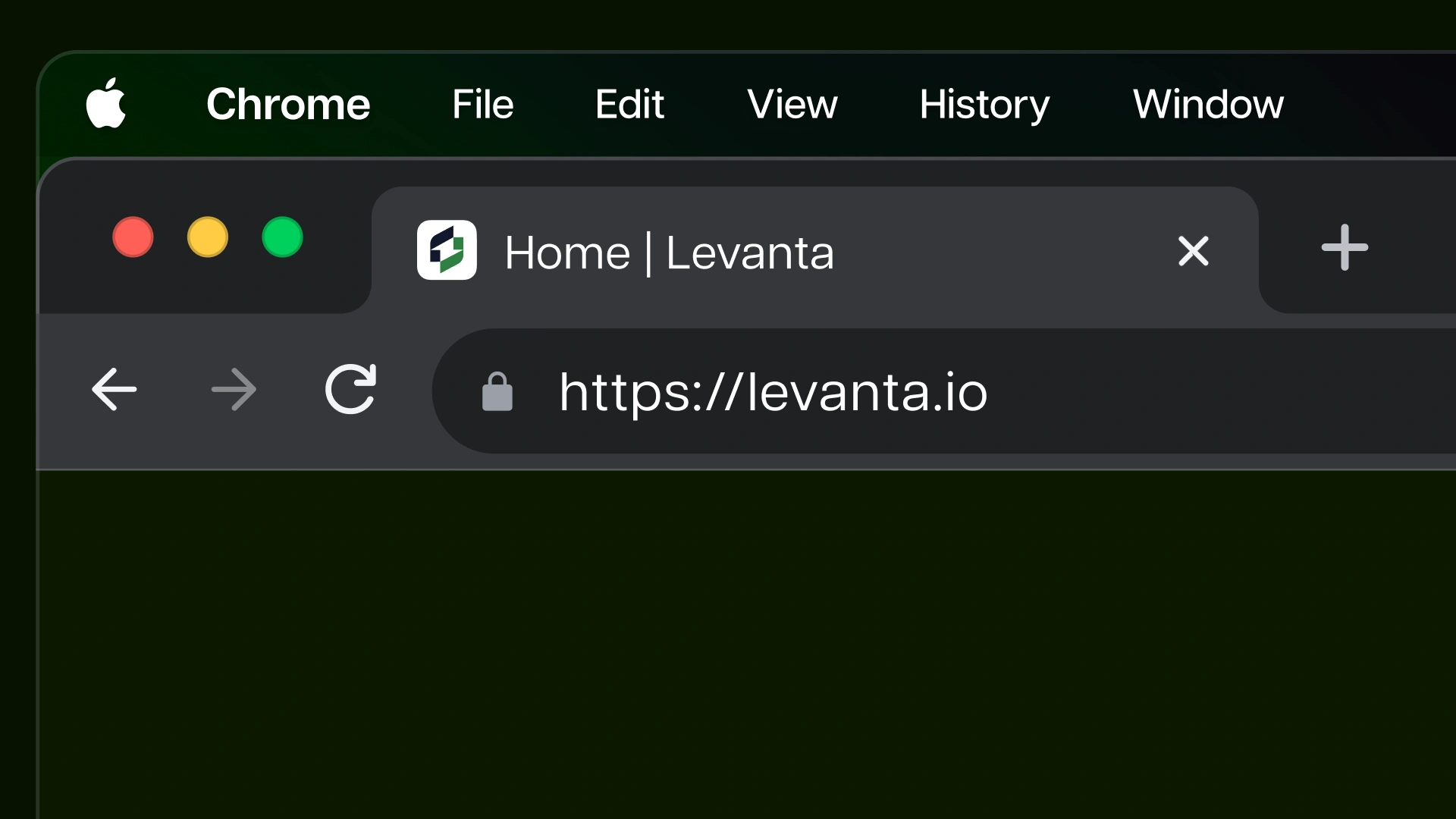
The browser tab icon is a small but visible touch that reinforces the brand every time the site is open. Icons share one grid, one line weight and one corner radius, so a set of icons looks like it was drawn by one hand.
The browser icon is a small but important brand touch. Icons are drawn on a consistent grid, with the same line style and weight across the set.

Print and e-book
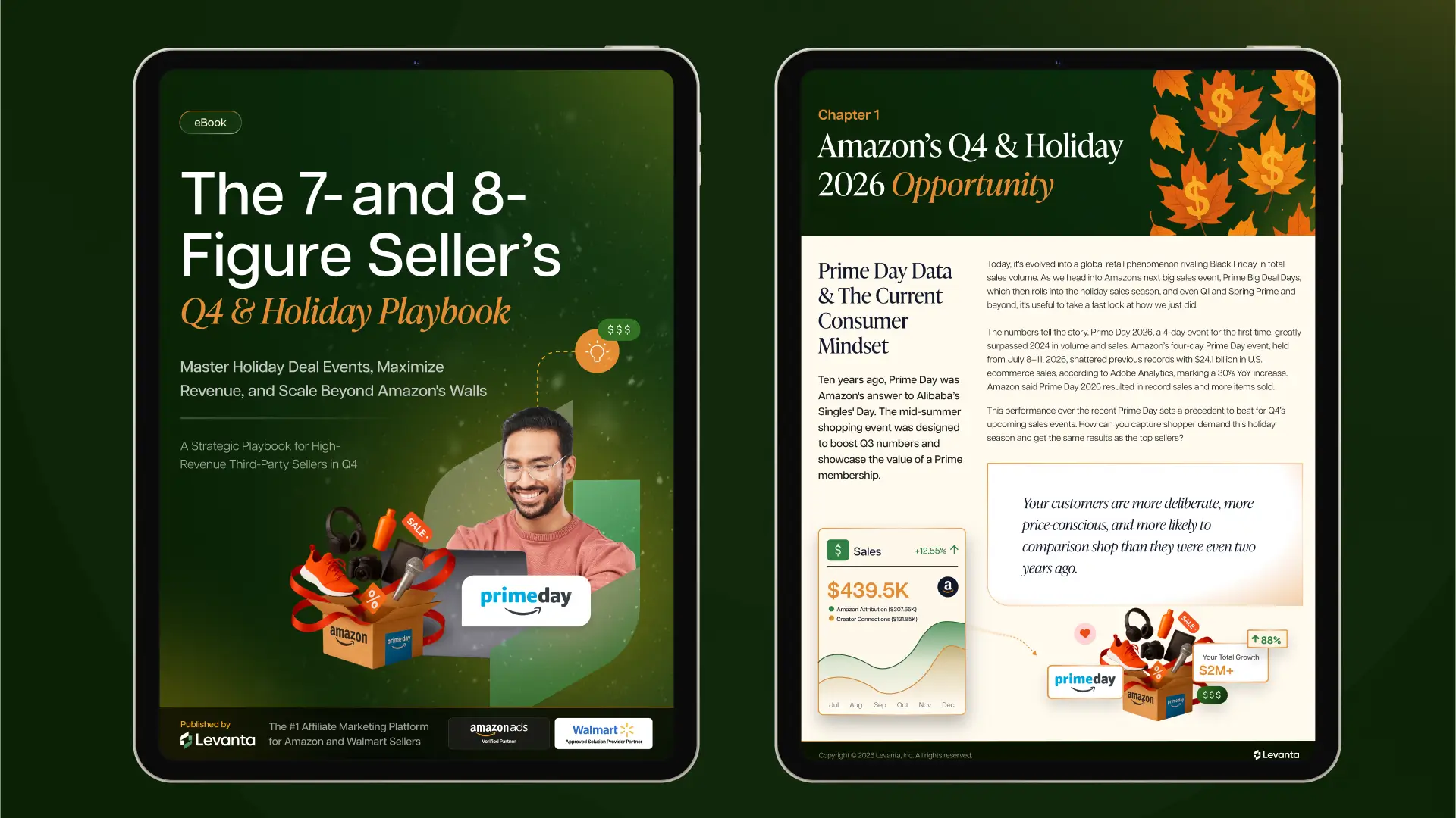
Longer content such as the e-book applies the same type and colour rules to a multi-page format. Headlines lead, the body text stays clean and the photography shows real sellers, which makes the guide feel practical rather than promotional.
Long-form content uses the same system. The e-book cover sets a headline in the brand serif with a strong seller topic, then carries the colour and photography rules into the inside pages.
Merchandise
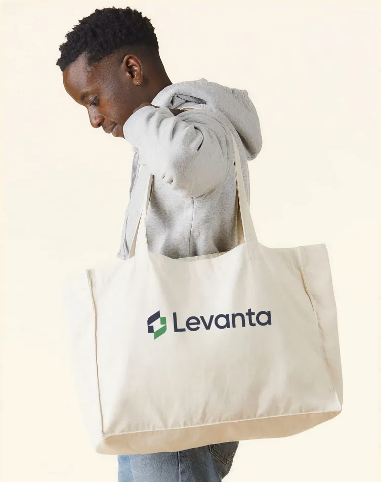
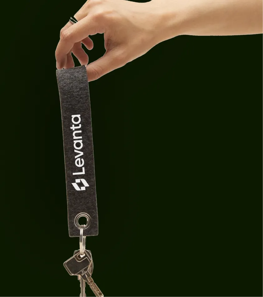
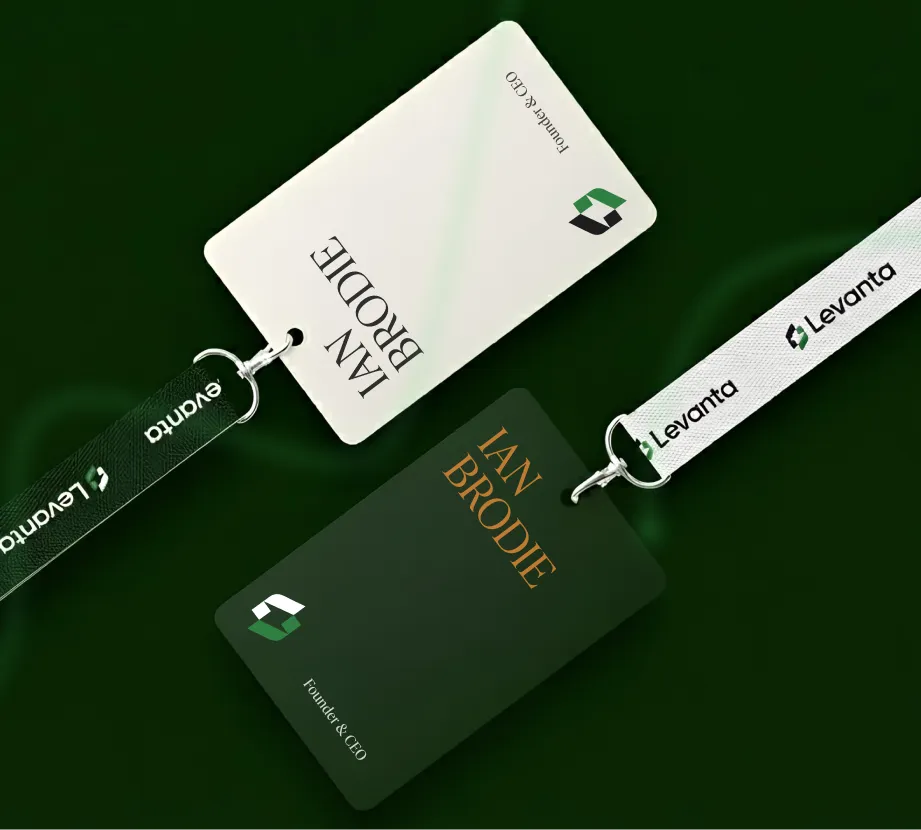
Tote bags, lanyards, cards and pens carry the logo in the core colours. Merchandise is part of the brand system, so the people who receive it see the same identity as on the website and in the seller materials.
Swag carries the logo in the same colours, so merchandise matches printed and digital material.

Website
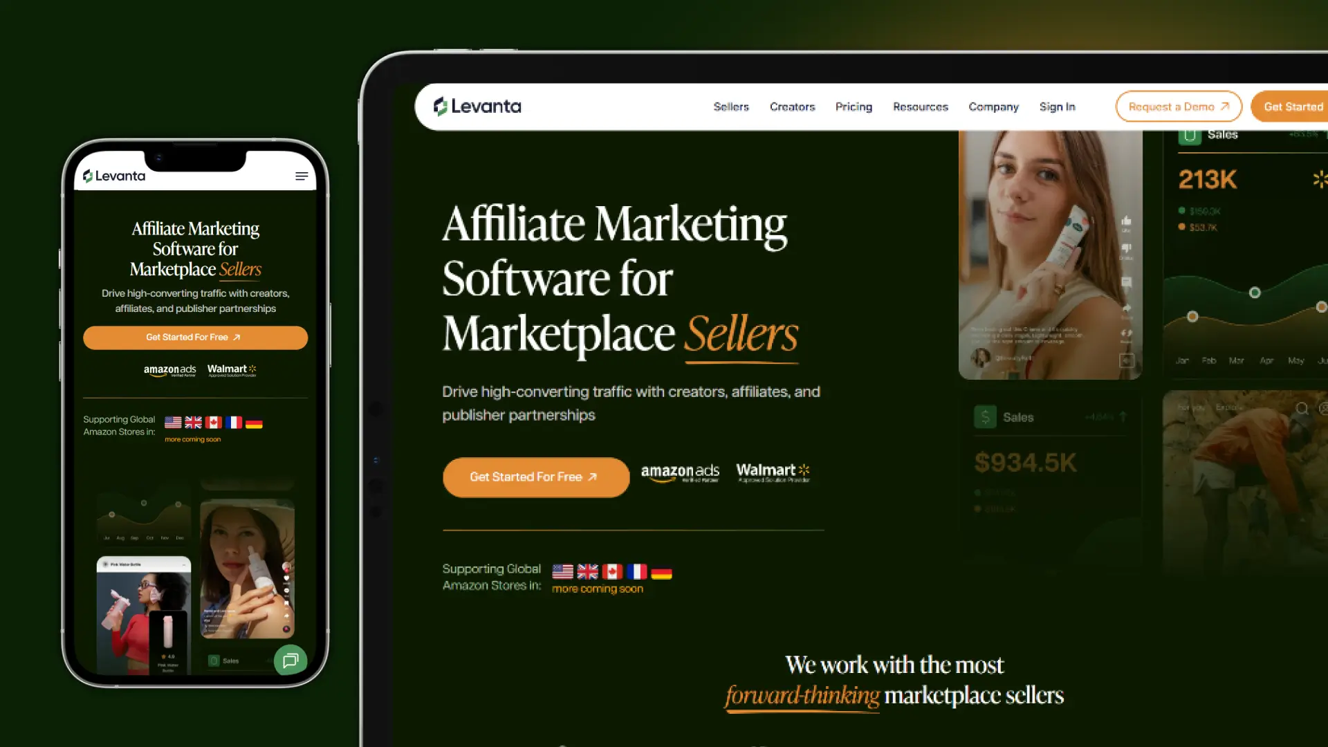
The homepage is built to get a seller to the next step quickly. The first line names the category, and the product screens show the platform working. The result is a page that explains the offer before it asks for anything.
The homepage leads with the seller message: “Affiliate Marketing Software for Marketplace Sellers”, followed by “We work with the most … marketplace sellers”. Product screens sit beside the headline, so a visitor sees the platform in use before reading the details.
Product dashboards
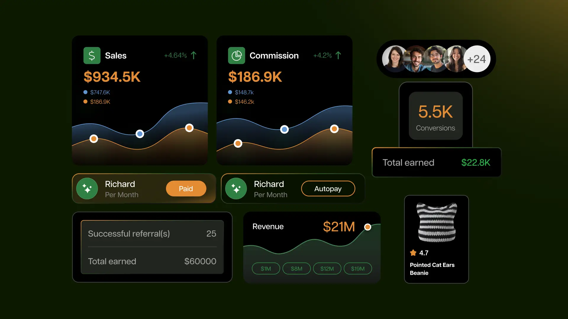
The dashboards show what a seller or creator sees day to day: sales, clicks, conversions and commission. Their style matches the website, so the product feels like part of the same brand. The figures are mockups and are shown only to illustrate layout.
The dashboards show the seller’s view of the platform: sales, growth, commissions and creator activity. The numbers on these screens are product mockups. They are not results from client accounts.




Photography
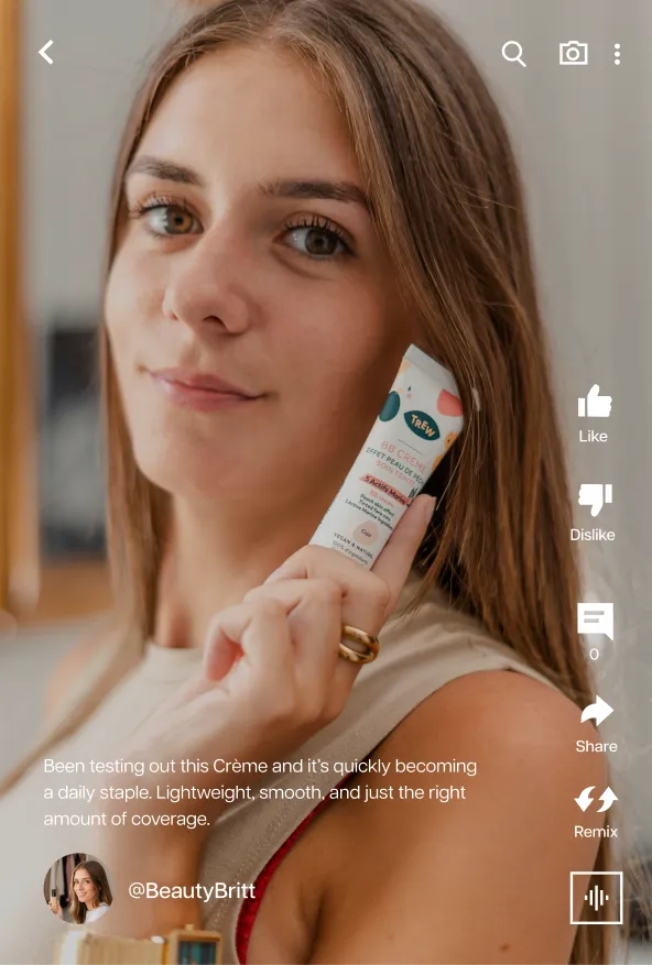
The photography brief asks for real people in real settings. Creators are shown shooting content, sellers are shown at work, and groups are shown together. This keeps the imagery honest and relatable to the audience that uses the platform.
Photography shows real people in real settings. Creators and sellers are shown at work, in everyday locations, in natural light.







Audiences
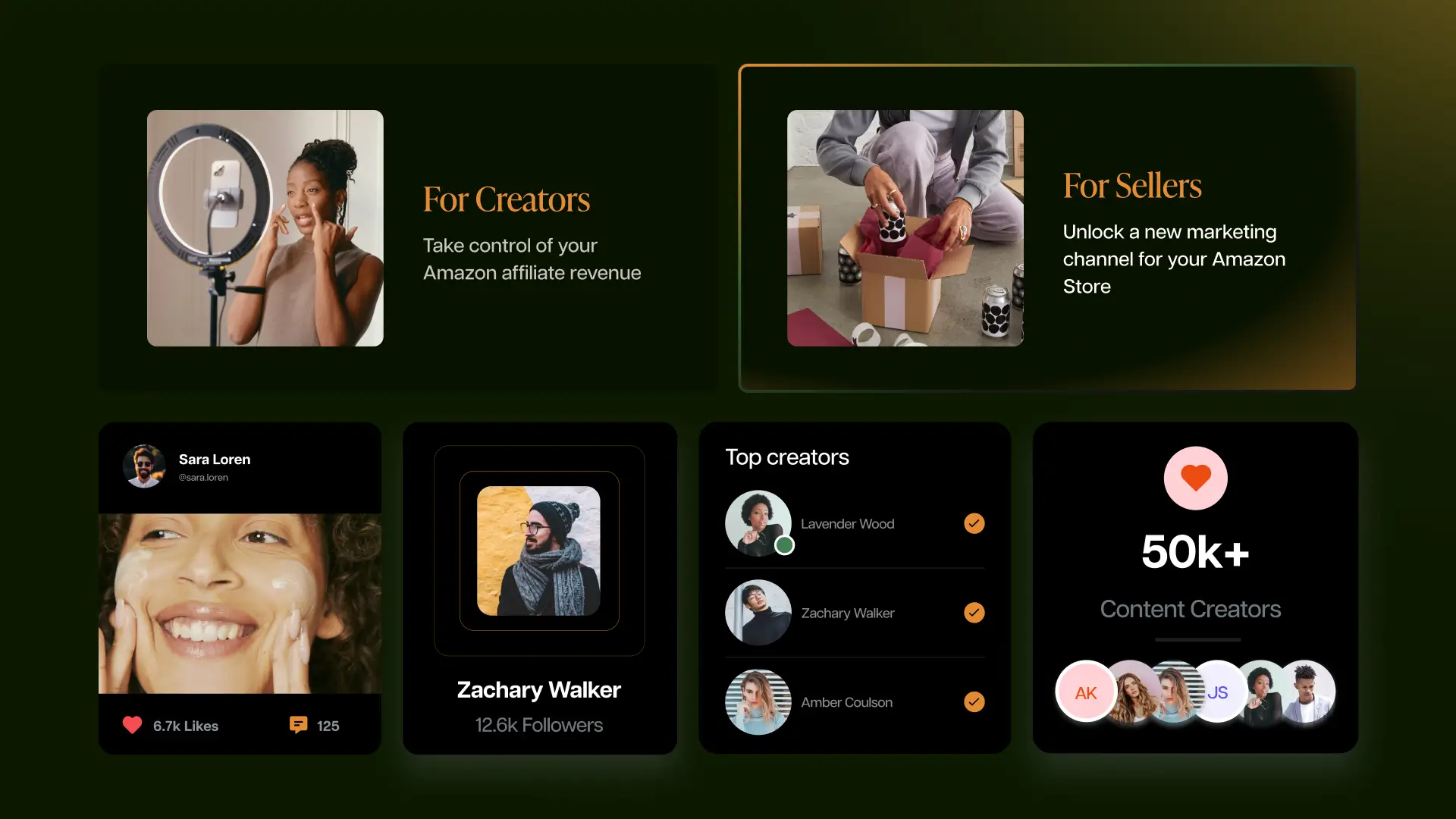
Creators and sellers get separate messages on the same page. For creators, the focus is control over commission. For sellers, the focus is a new channel for their Amazon store. Keeping the two messages side by side shows that the platform serves both.
The brand speaks to two audiences in parallel. For creators, the message is about taking control of commission. For sellers, the message is about a new marketing channel for their Amazon store.
Team
The team headshots show the people behind the platform. The brief asks for realism, confidence and warmth, which matches the rest of the brand and gives the company a human face.
The team headshots are shot in a warm, natural style. The brief for team photography is to show the realism, confidence and warmth that define the brand, and to show people working together.


“We’re impressed with 11thAgency’s design quality.”
“11thAgency has helped us take our vision to the next level.”
“They are very communicative, and typically have drafts and iterations of projects done within a day or two. They take feedback very well and are quick to update according to said feedback.”
Richie Carreon
VP, Marketing, Levanta


