Brand child of Evolus, Jeuveau is a prescription medicine that is injected into muscles and used in adults for a short period (temporary) to improve the look of moderate to severe frown lines between the eyebrows (glabellar lines).
It’s a modern-made product, so it needed a contemporary design approach; as per the perspective defined by Evolus, the product was mainly targeting middle-age females, so the selection of colors and design was to be accordingly.
SERVICES PROVIDED
- Landing Page Design
- Illustrations
- Unbounce
- Sales & Marketing
- Custom CMS
- Front End Development

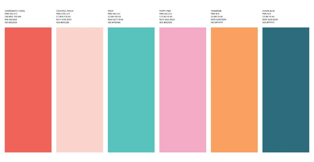
Color Approach in Innovative Branding
Young, fresh, beautiful, attractive, elegant attributes that Jeuveau promise, so our color selection must narrate those attribute. We can’t afford to have stodgy designs, be it a bit over, but the design strategy had to be modern-made.
Eye-catching colors were our preferred picks, we decided on a multiple color approach to have more options while designing artworks to play around with.
Typography
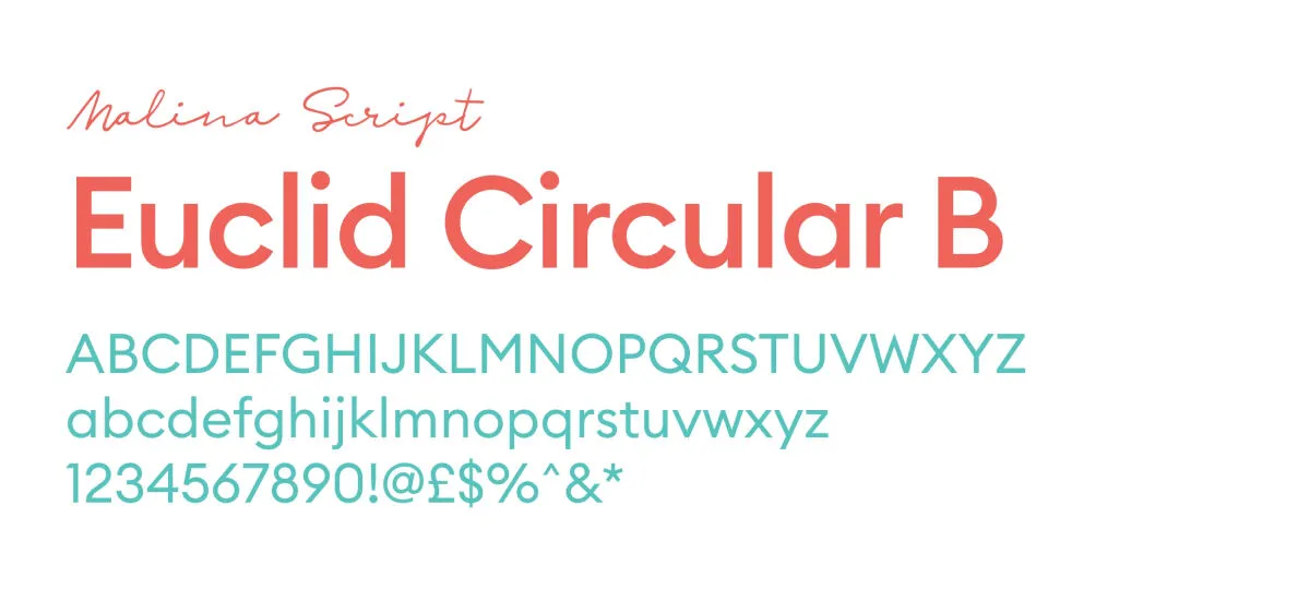
After being visually acceptable, your design content must be easily readable; the charm of content is what keeps your artwork alive in people’s minds. Evolus is a global brand, so writing that will be acceptable to all cultures was our focus.
For the branding to be conclusive, a perfect blending of color and font is essential. As we were working with top-notch designers from around the globe, it was amazing to see their branding approach and focus on the details.
Product Branding
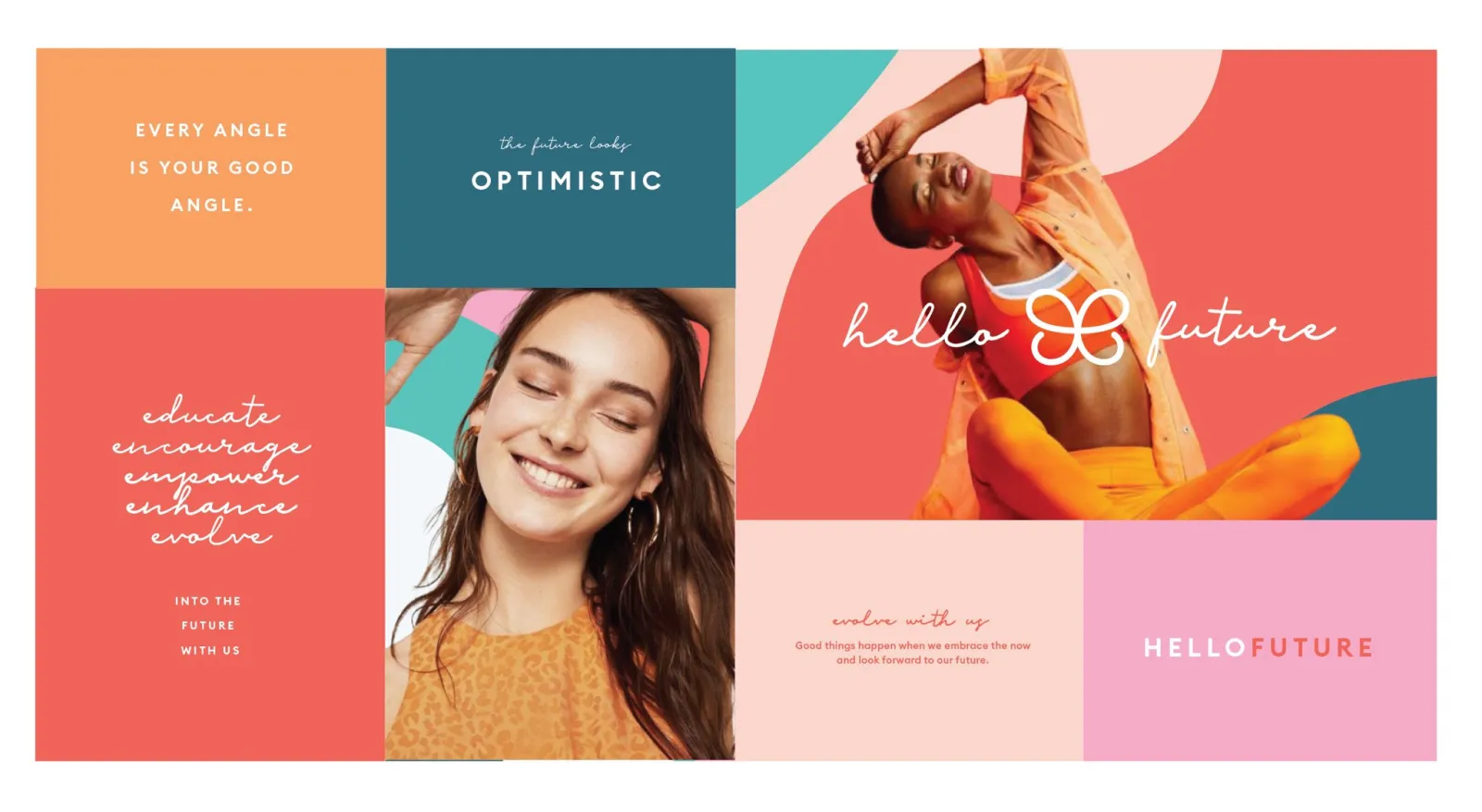
To design your product cover, you need to have the answer to a few questions around which designs will be created. Attributes of your product, what purpose your product serves, and which target audience is using your product.
Answering the above-mentioned question, we designed the product cover, that’s a combination of custom-designed elements and realistic images.

Social Communication
Two different approaches were adopted while designing social media marketing ads and digital advertisements; one was heavily dependent on custom artworks, while the other was more human-centric, with realistic images.
The previous approach was more humble, whereas we wanted to position them as market leaders, a hint of arrogance, but the purpose is to show confidence in the design approach.
The design language was friendlier, approachable, and depicts the authenticity of the product. We are focused on gaining trust and creating a strong brand image in the market.


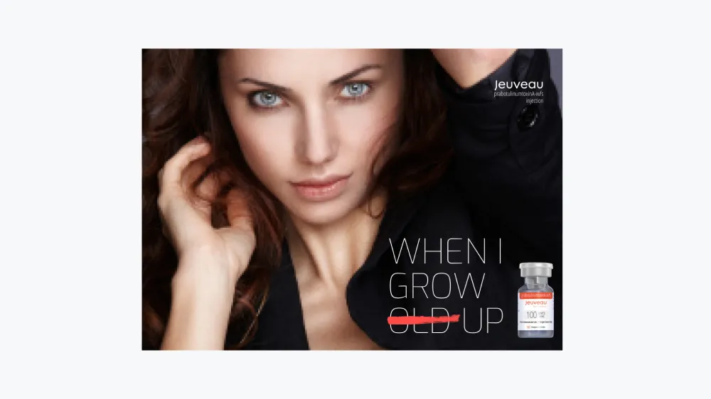


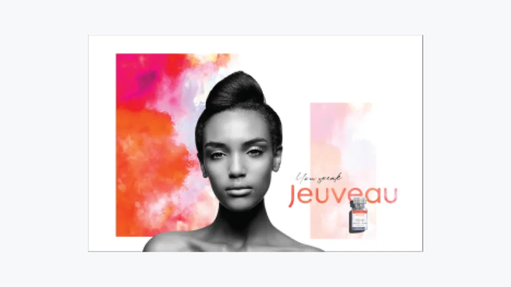
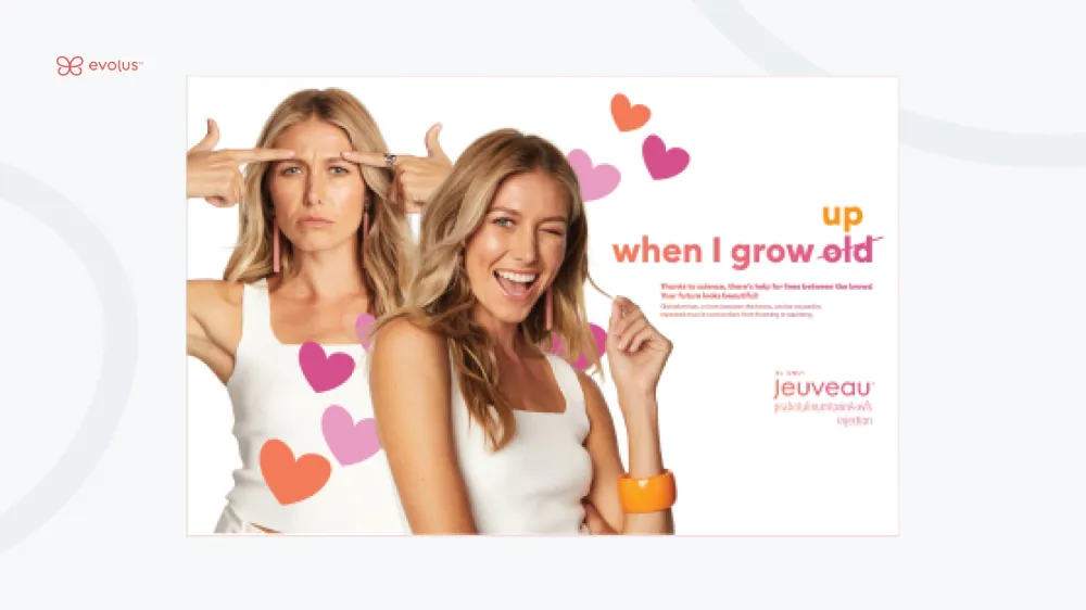
Designing custom artworks that are attractive and relatable helps you sell more products, and that’s what we try to execute.
15% Increase In Sales
40% Increase In Social Engagement
50% increase In Page Likes & Followers
”The most appreciable skill was how well they comprehend the requirements and deliver a carbon copy, 11thAgency had a neck of surprising us with innovative ideas


